Surprisingly many service companies still fail to recognize the website as a crucial tool for bringing in customers and not just occupying the domain with the company name. We have highlighted several industries where we often encounter pages that make us cringe or tear our hair out. Of course, take this with a grain of salt. The list is subjective, selective, and certainly not applicable to every market.
HEALTHCARE
Although medicine is a field known for rapid technological advancements, the industry's digital marketing and communication tools often need to catch up by several years.
Though the mobile-first design is now standard, many healthcare companies and facilities' websites expect you to magnify the text with your fingers. Not to mention the outdated, stock-image-based design.
Booking appointments, if possible at all, is often not done directly on the site but by redirecting to an external tool. This lack of direct integration can impede effective marketing campaigns, which rely on accurate and comprehensive data to target the right audience and optimize conversions.
Healthcare companies' websites, if they are to be functional tools for patients and not a pretense, need secure login options (and general security in line with local regulations), integration with various databases, clearly listed locations, and easy-to-use and fully integrated booking systems.
Common sins:
.jpg)
.jpg "Top industries with worst websites? Need website refreshment for your healhtcare company?") Although medicine is a field known for rapid technological advancements, the industry's digital marketing and communication tools often need to catch up by several years.
Although medicine is a field known for rapid technological advancements, the industry's digital marketing and communication tools often need to catch up by several years. - Not thinking mobile-first.
- Outdated design.
- Lack of important information.
- No regular updates.
- No integrated booking tools.
LOCAL GOVERNMENT
The websites of government institutions, especially the smaller ones at the local level, are often living proof of entropy. Information is placed on them without any hierarchy or structure. It's begging for an advanced CMS to organize content similarly to news media sites.
Government websites often suffer from a range of usability issues that make it difficult for visitors to find the information they need. Common problems include outdated, clunky designs that are not user-friendly or visually appealing, slow loading times that test visitors' patience, and confusing navigation structures that can lead to frustration and dead ends. Given the importance of government services and information, it's crucial that these websites are designed with user needs in mind and optimized for fast, easy access.
Their advantage is often that legal regulations force administrators to provide facilities for people with disabilities, such as the ability to adjust the font size, contrast, or one-key operation. However, this is not the rule in every case.
Common sins:
- Disordered information structure.
- Outdated design.
- Non-intuitive navigation.
- Slow loading time.
EDUCATION
The websites of many educational institutions, especially universities, often give the impression that they were created with employees and students in mind... and no one else. Excessively extensive menus often reflect the school's administrative structure, making it utterly incomprehensible to outsiders.
Understandably, school staff and students are the primary users of their sites, but this approach to structure hurts the school's recruiting tasks, for example.
The dispersion of functions is also often a problem for educational websites. The homepage, pages of subordinate entities such as departments, and systems for managing grades, exams, or attendance are managed using different systems. At the same time, they could be integrated by one multifunctional digital experience platform.
Common sins:
- Internal focus.
- Dispersion of functionalities.
- Vague navigation and excessively extensive menus.
LAW FIRMS
We dare you to find a good law firm website with all three: online booking, working question form, and no broken links in the menu. Ok, there probably are few since there are so many great legal marketing agencies out there. But it is often on these very sites that we find ourselves at a loss, struggling to locate even the most fundamental information or arrange a simple consultation.
Sure, it's one of those industries where truly valuable customers are acquired the old ways - referrals, bidding, or just the "transcendental power of reputation," not from Google or Facebook groups. However, every law firm would probably benefit from treating their business more like an e-commerce business with a clear customer journey.
Potential new clients of a law firm want to first learn about the attorneys' specializations and the types of cases they deal with, then quickly arrange a consultation at a selected date or send an inquiry and expect a response. On the other hand, regular customers might like to use secure online access to their legal documentation.
Yet many of the pages of even large companies are simple sites built with Wix or a similar platform on a default template, and the only practical purpose they serve is to display a phone number and address.
Common sins:
- The most exposed information is something clients don't care about (e.g. "Our company has been operating for 30 years...").
- Homepage cluttered with news and articles that can only interest other lawyers.
- No well-thought-out customer journey.
- Contact forms don't work or don't exist at all.
- No online payments.
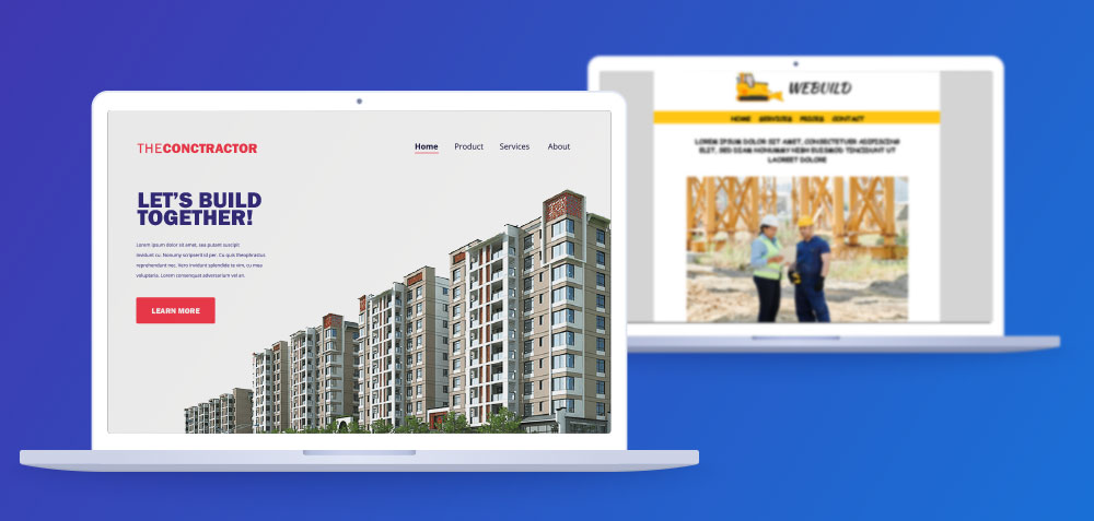
CONSTRUCTION AND ARCHITECTURE
It's an industry that begs for websites seamlessly integrated with advanced tools for intuitive 3D design tools, accurate pricing calculators, and beautiful visuals, but so often... don't have any of these.
There are so many websites of construction companies with the same generic stock photos of city skylines and workers in yellow protective helmets that they sort of blend together after a couple of hours of researching scaffolding prices.
These websites are likely to be visited by laypeople unfamiliar with building materials and construction. Therefore, a clear menu structure and transparent pricing are crucial. Technical specifications and digital pricing tools should also be explained to avoid confusion. Otherwise, customers may struggle to distinguish between different products and their features.
Common sins:
 It's an industry that begs for websites seamlessly integrated with advanced tools for intuitive 3D design tools, accurate pricing calculators, and beautiful visuals, but so often... don't have any of these.
 - Unclear customer journey.
- Lack of tools facilitating precise pricing of services and materials.
- Generic design.
Do you think we missed any industries? Maybe it got you thinking about your website? Either way, get in touch with us and schedule your free consultation about web development.